Make exploration visual
Destination imagery and experience cards lead the home screen.
Why this decision?
People can recognise what interests them before opening the details.
Travel & discovery
From a place worth seeing to a trip worth taking.
A travel discovery and booking concept with an end-to-end journey from inspiration to checkout.
Explore the story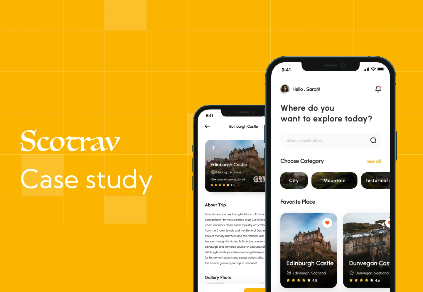 Mobile app
The problem, contribution, key decisions and experience. Switch to Full story for more detail.
UI/UX Designer
Mobile app
Travel & discovery
UX/UI case study
THE STORY IN 30 SECONDS
MY CONTRIBUTION
My focus in this project was the user experience and interface design.
THE PROBLEM
Scotrav explores a mobile journey for finding travel experiences, reviewing an option, and moving through checkout. A light interface and warm yellow accents keep the emphasis on places and choices.
How can a traveller move from browsing to choosing an experience without losing context?
RESEARCH & FRAMING
The original study includes a traveller persona with goals and pain points, followed by wireframes. The designed journey moves through discovery, experience details, and checkout.
BEFORE THE SOLUTION
Moodboard
Persona
Wireframes
High-fidelity design
Prototype
KEY PRODUCT DECISIONS
Destination imagery and experience cards lead the home screen.
People can recognise what interests them before opening the details.
An experience detail screen sits between browsing and checkout.
Choosing and booking are related tasks that need different information.
The concept includes the booking steps rather than stopping at a browse screen.
The experience needs to support the commitment as well as the inspiration.
PRODUCT EXPERIENCE
Onboarding introduces the travel experience.
Browse a visually organised home screen.
Review the selected experience before booking.
Follow the booking journey to its final screens.
The entry screens introduce Scotland and its attractions before bringing travellers into visual discovery.
Select a screen to view it larger.
Experience details lead into date selection, traveller details, and payment. The concept carries the journey through the commitment.
Select a screen to view it larger.
OUTCOMES & REFLECTION
An end-to-end discovery and booking concept
Persona, wireframe, and high-fidelity design artefacts
A light mobile interface with a consistent amber accent
The next question to test: what information do travellers need before they feel ready to book?